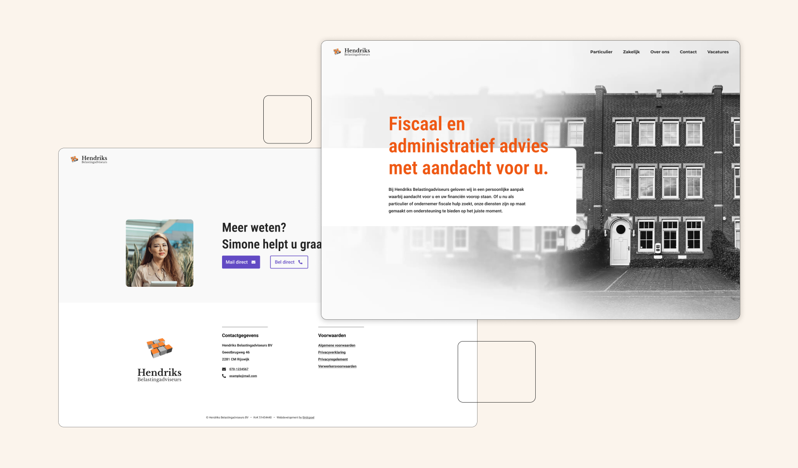
Hendriks Belastingadsviseurs wanted me to redisign their website, which had not been updated in well over 15 years. The old site being a cluttered 4:3 ratio onepager, which although nostalgic, does not meet today’s digital standards.
As I’d be doing both the design and development for this project my objective was to focus on three key improvements:
1. Clear seperation of information: The old site presented all content on a single page, making it difficult for users to find relevant information. I restructured the site with distinct sections and pages, ensuring that content was easy to find and logically grouped for a better user experience.
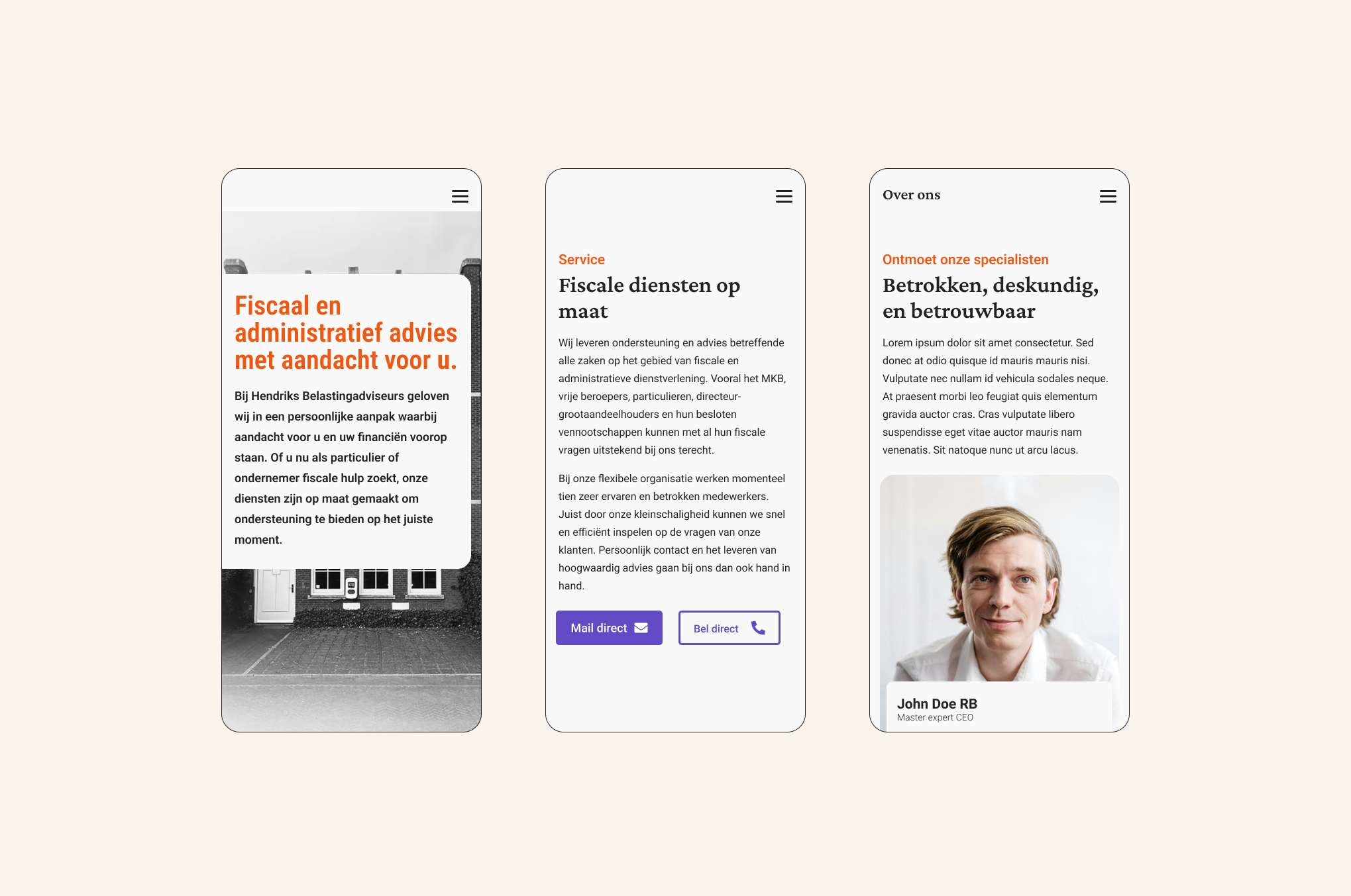
2. Responsive design: Since the old site wasn’t mobile-friendly, I built the new design to be fully responsive, providing a seamless experience across all devices.
3. Google Lighthouse score: As a key performance metric, I set a goal of achieving a Google Lighthouse score of 95 or higher. This target helped me implement best practices in performance, accessibility, and SEO, ensuring the site was both efficient and user-friendly.


